Democratic Progress of the Last Century: Hope for the New Decade
By: Emily Walsh
Jan 13, 2020
With the first Graph of the Week in 2020, we want to highlight the positive outlook that Harvard Professor Steven Pinker aired in his recent piece for the Financial Times.
Professor Pinker pointed to drastic rising literacy rates and declining deaths in war, providing readers hope that progress is happening. Pinker also employed ‘Our World In Data’ interpretation of the V-Dem variable “Regimes of the World” (RoW) to demonstrate the steep rise of democracy over the past 118 years with the number of autocracies in the world declining.
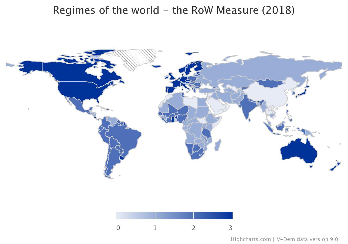
V-Dem’s RoW-measure provides a direct “big picture” of the state of the world. It condenses data on over 50 variables collected for any given country, returning a single score representing the regime type of that country in that year.
0 = Closed Autocracies
1 = Electoral Autocracies
2 = Electoral Democracies
3 = Liberal Democracies
With one of our 13 graphing tools available for free use on the V-Dem website – Interactive Maps – the first graph below shows the regime type for all countries in the world in 1900. The second graph shows the most recent data we have – end of 2018. Note, for example that India now after the recent years of decline is only an electoral democracy, same as Nigeria and the Philppines.
The Interactive Map-tool makes it easy to visualize the developments of democracy across the world during the twentieth and twenty-first century!
Visit the V-Dem website to explore and see the individual scores for countries or check out the other free analysis tools available!