New Online Analysis Tool – The Radar Graph!
By: V-Dem Staff
May 31, 2017
This tool can be used to display multiple variables and/or indices for one country in a radar chart. With the tool you choose a single country or region and compare multiple question results. In the radar graph you can then see the aggregated data by year, the first and last year of the time period you choose.
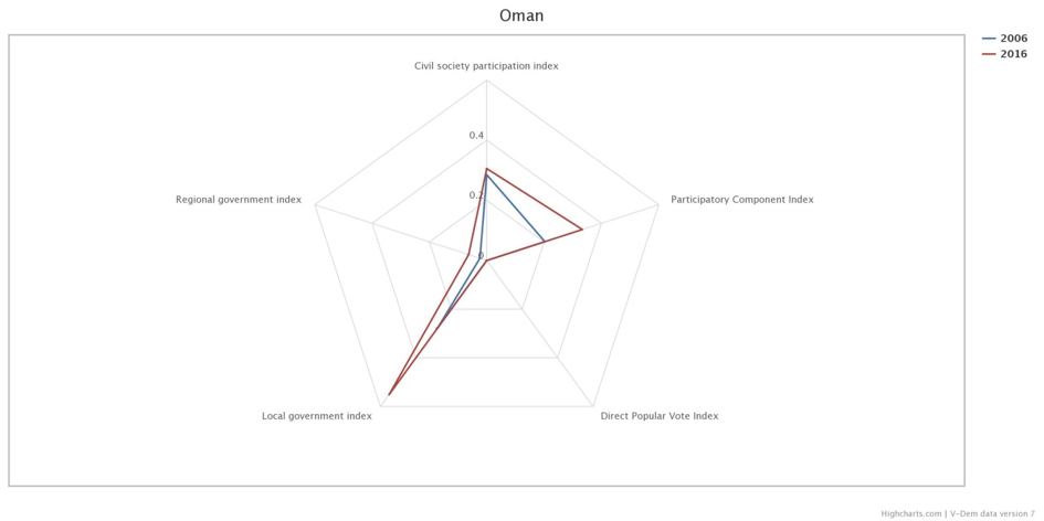
To explore the Radar Graph Tool we will take a look at the Participatory Component Index and its different subcomponents in Oman, a country that has improved in this dimension in recent years (read more in the V-Dem Annual Report 2017). In the graph the blue line represents the different indices in 2006 and the red line in 2016. The scores should be interpreted as relatively high or low depending on how far they fall from the center of the plot. Comparing the different indices we can see that the most prominent change for Oman was in the Local Government Index. This is due to Oman’s first-ever local elections in 2016, which also caused an overall increase in the Participatory Component Index.
To further explore the Radar Graph Tool or the democratic development in Oman with another of our Online Analysis Tools visit v-dem.net.