Graph of the Week #100
By: V-Dem Staff
Nov 09, 2017
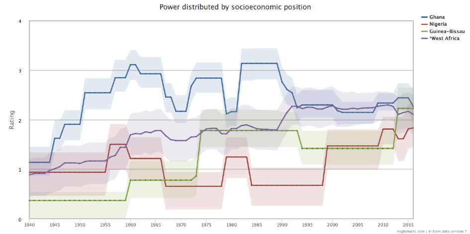
This is the hundredth graph of the week! The first graph, published in November 2014, looked at the power distribution by socioeconomic position in Ghana, Nigeria and Guinea Bissau. Back then, we only had V-Dem data up until 2012. Let’s look at the development of this indicator in these countries with the data we have today.
The indicator on power distribution by socioeconomic position measures to what extent wealth and income translates into political power. While a low value on the scale is an indicator for a society with a high degree of economic inequality, wealthy people enjoy virtual monopoly on political power, a higher value indicates a society in which the differences in political power between rich and poor are not so great.
In the graph, we can see that all three countries had noticeable fluctuations in power distribution until more recent years when they approached the West African average. Although Ghana performed comparatively better on this indicator for the majority of the last century, it is interesting to note that its decreasing scores now approach the increasing scores of Nigeria and Guinea-Bissau. Hence, all countries are now around a level where wealthy people have a very strong hold on political power, while people of average and poorer income have substantially less influence.
To read our other hundred graphs, or discover the data yourself, visit our website at v-dem.net.